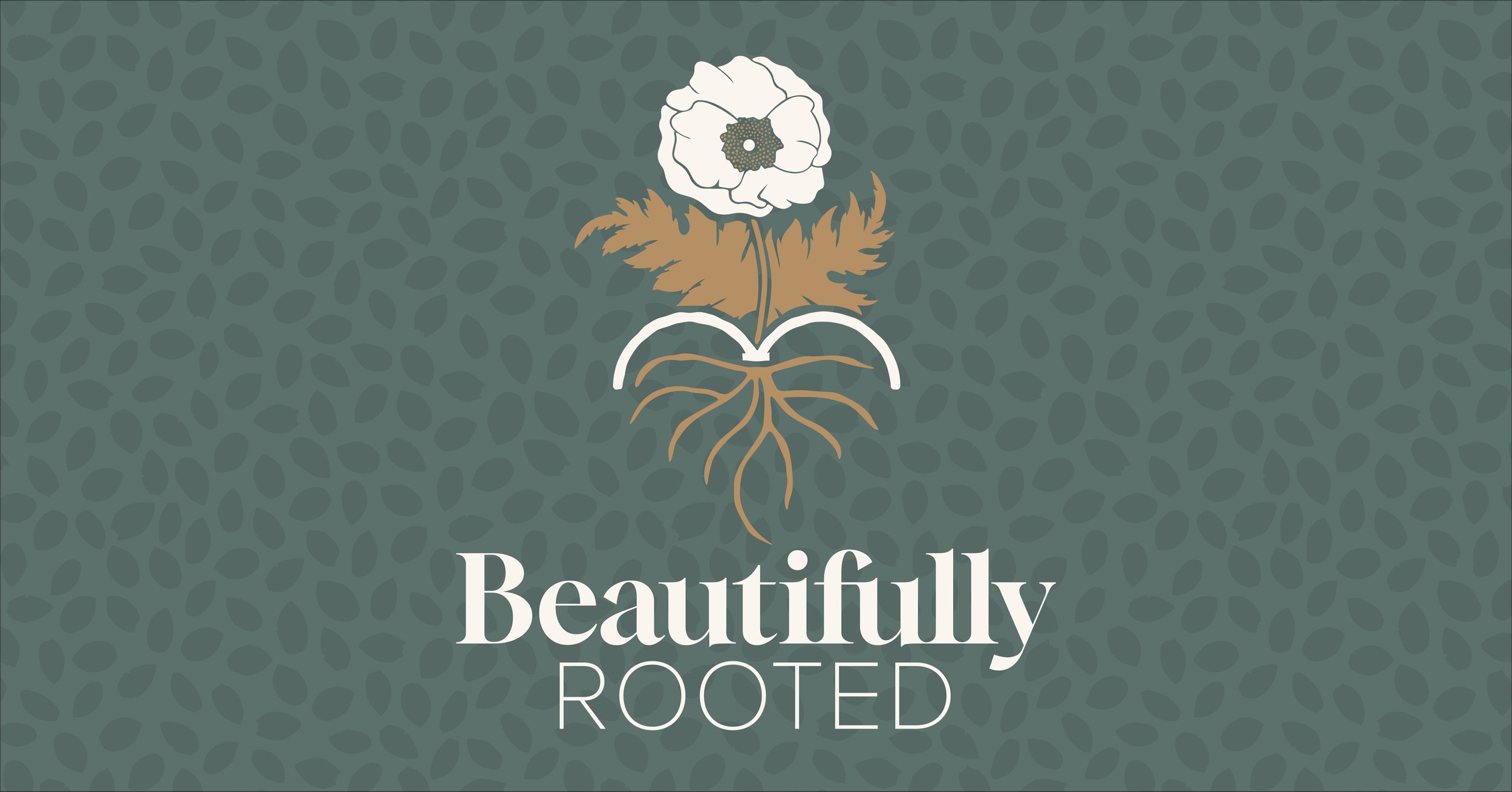
Beautifully Rooted
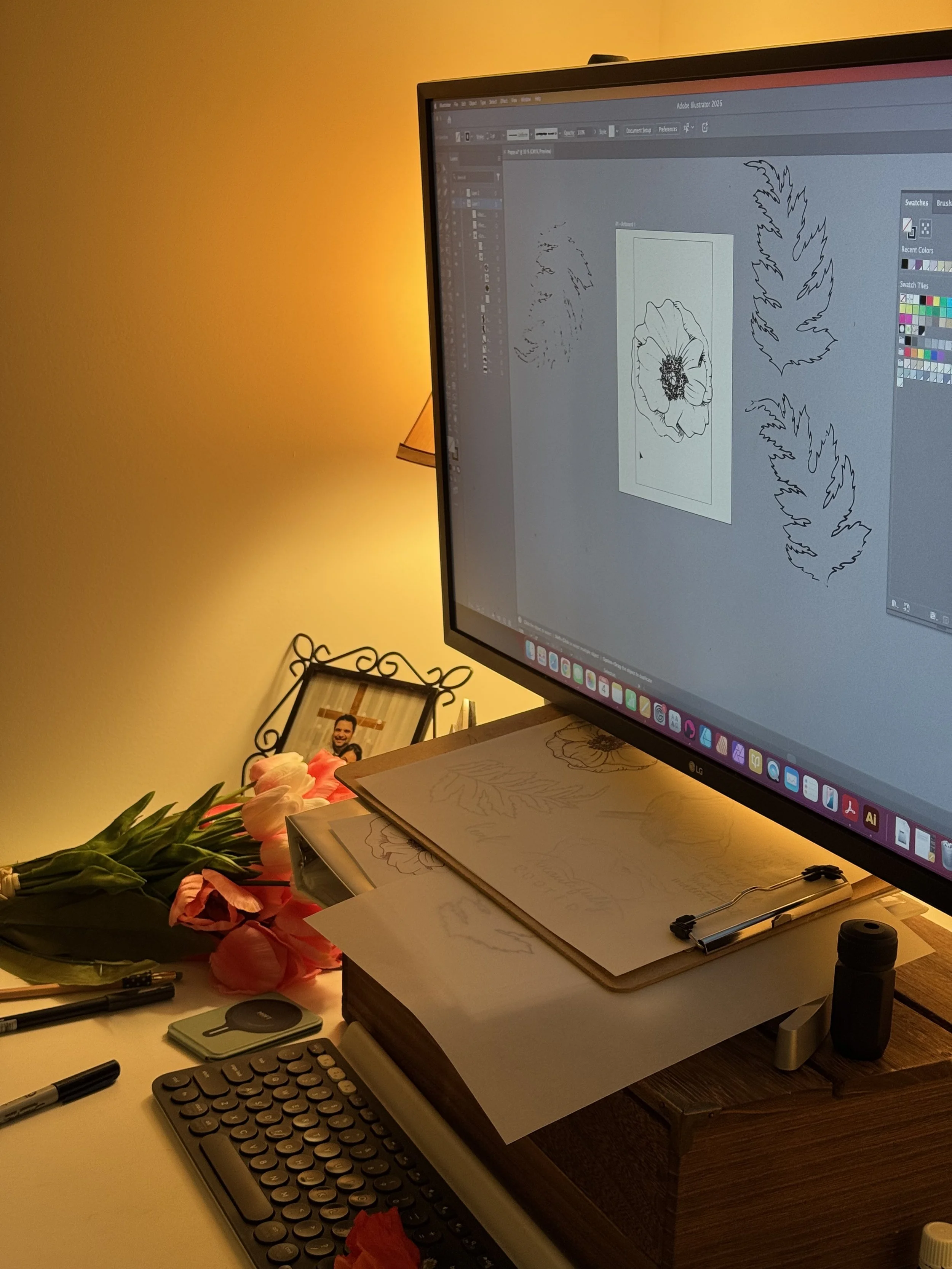
Have you ever wondered how a logo is brought to life? Below is a quick behind the scenes peek at the work that went into the Beautifully Rooted branding.
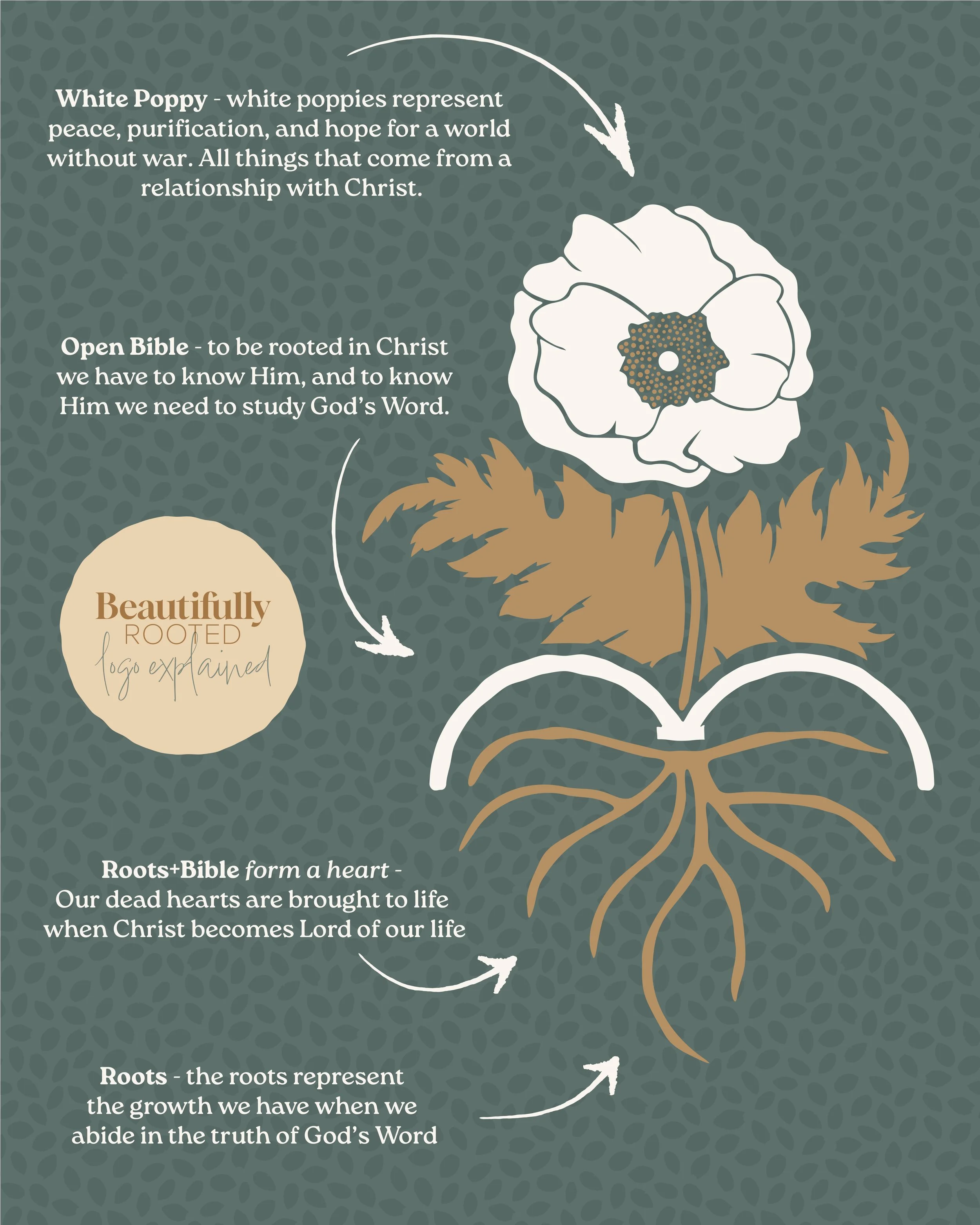
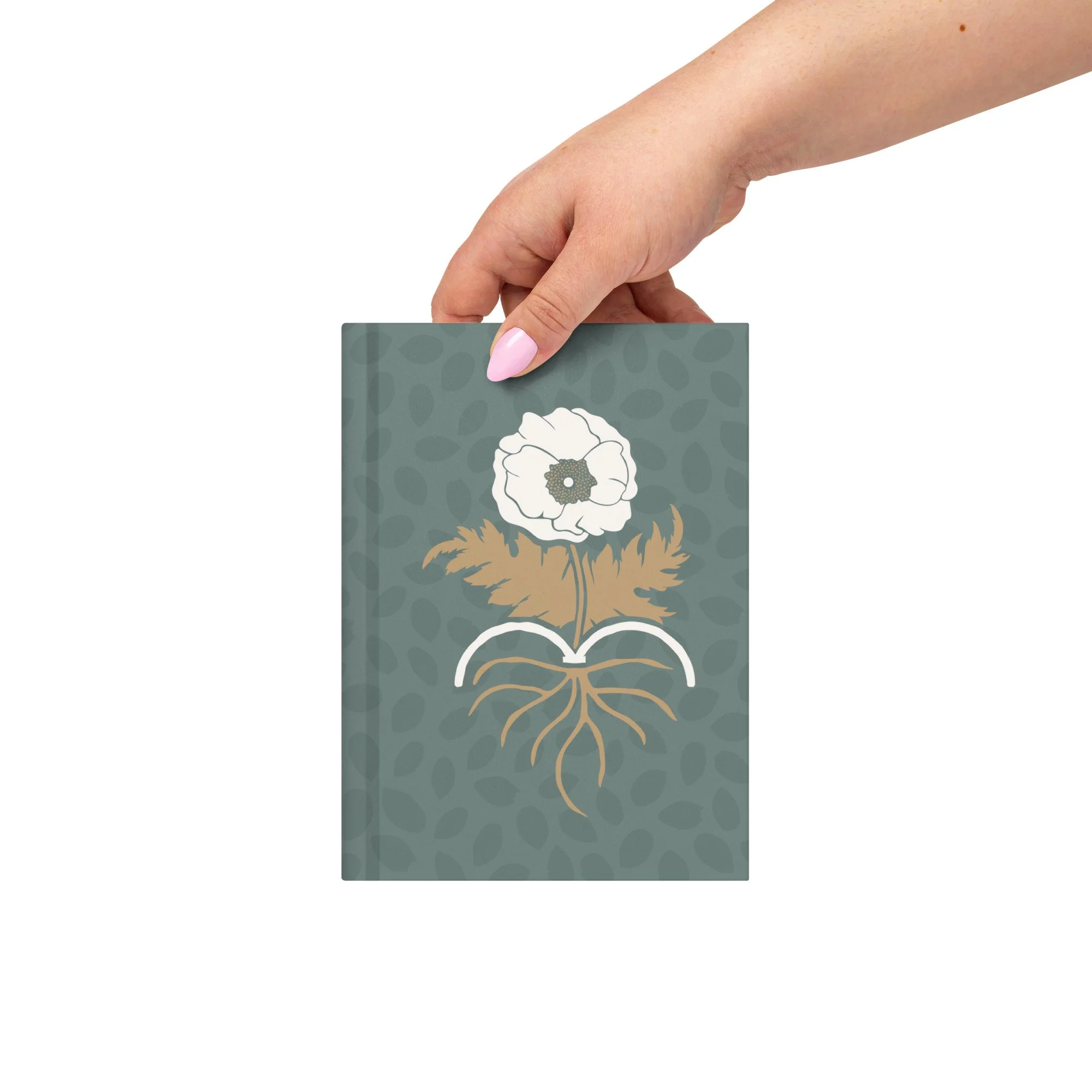
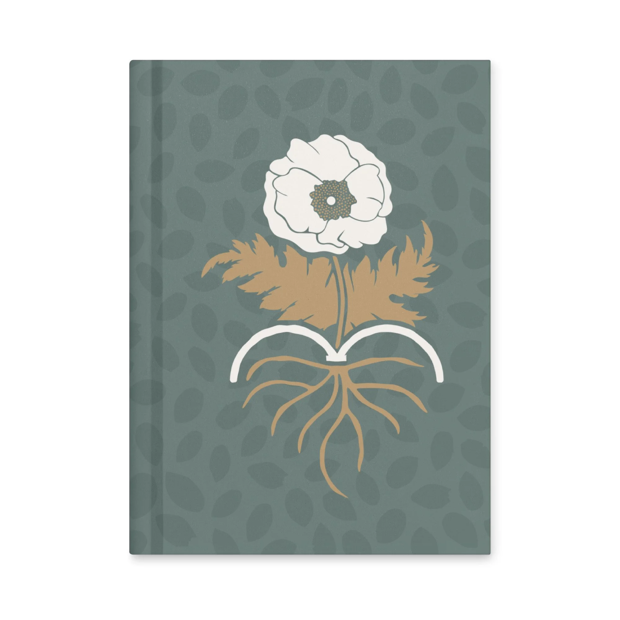
The Logo Explained
The graphic explains the meaning of the different elements in the Beautifully Rooted logo. Every element was chosen to point to the bigger picture, that True Beauty Blooms When We’re Rooted in Christ!
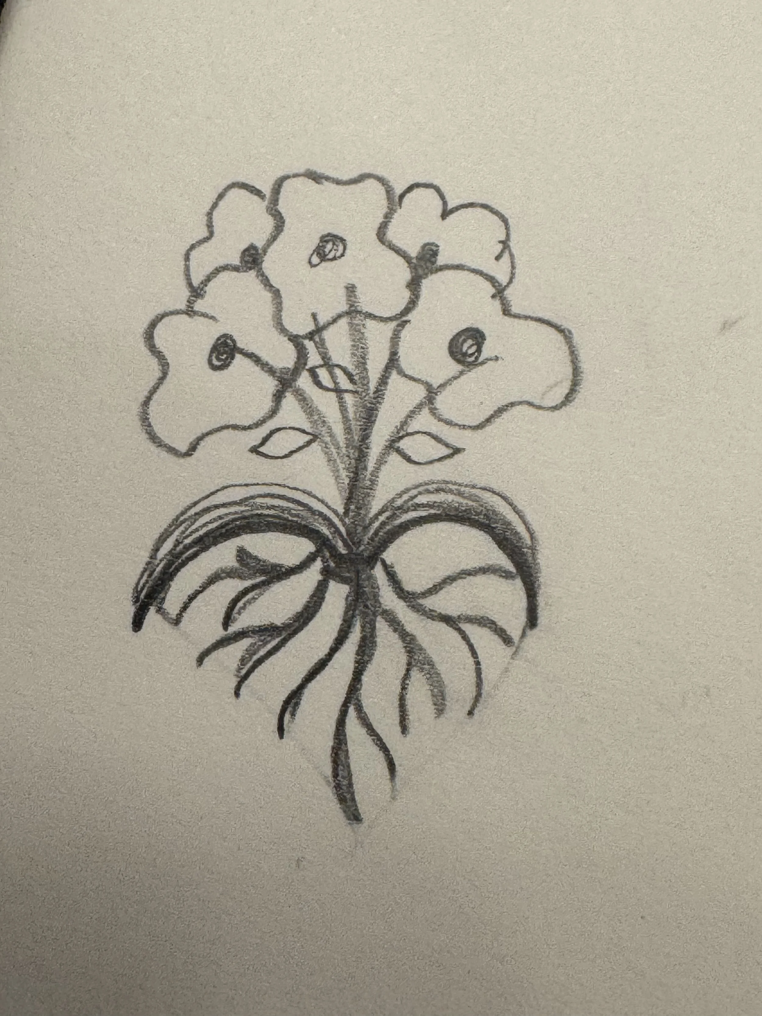
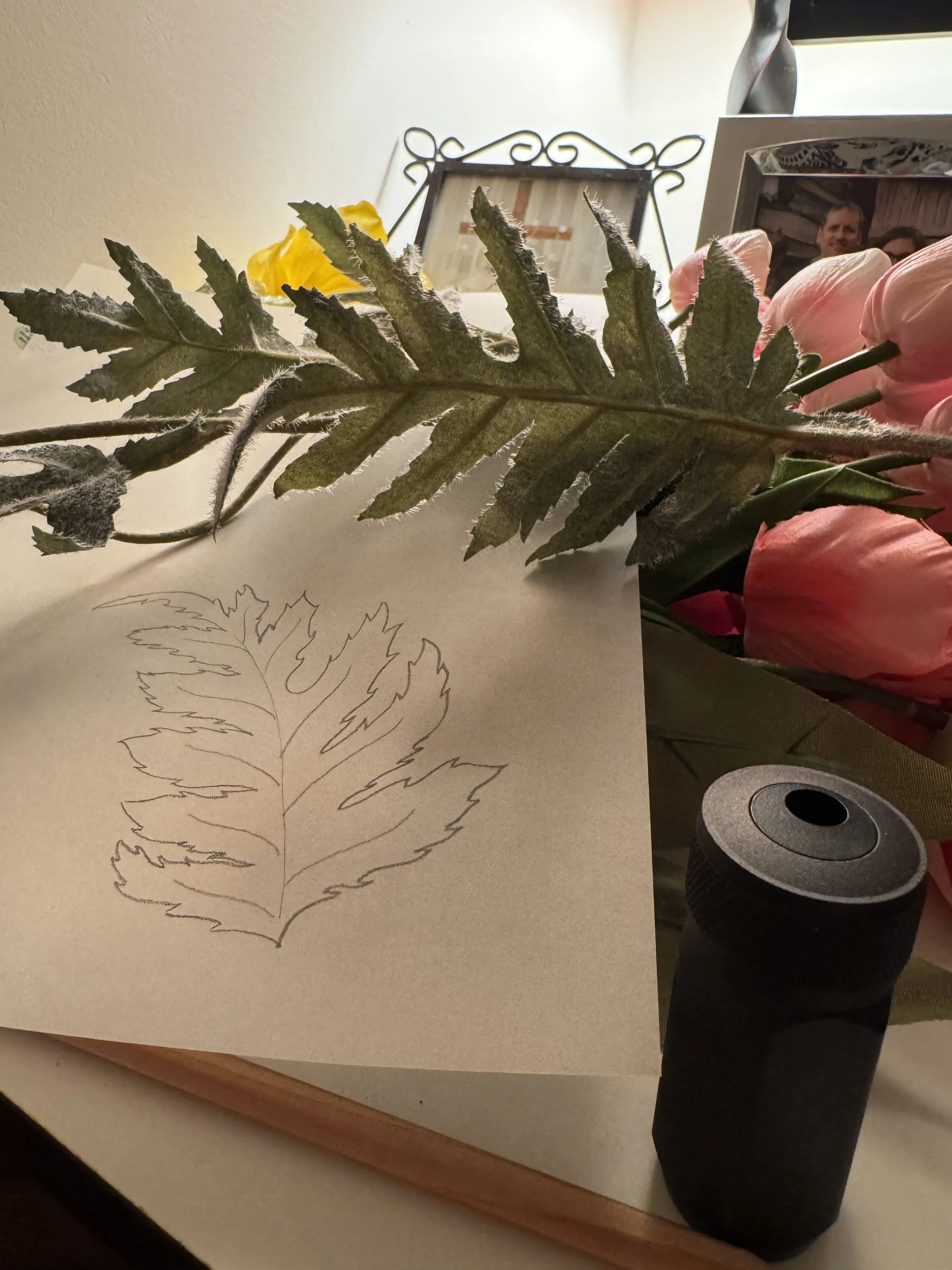
Scroll down to see my initial sketch for this logo, and a few stops along the way.
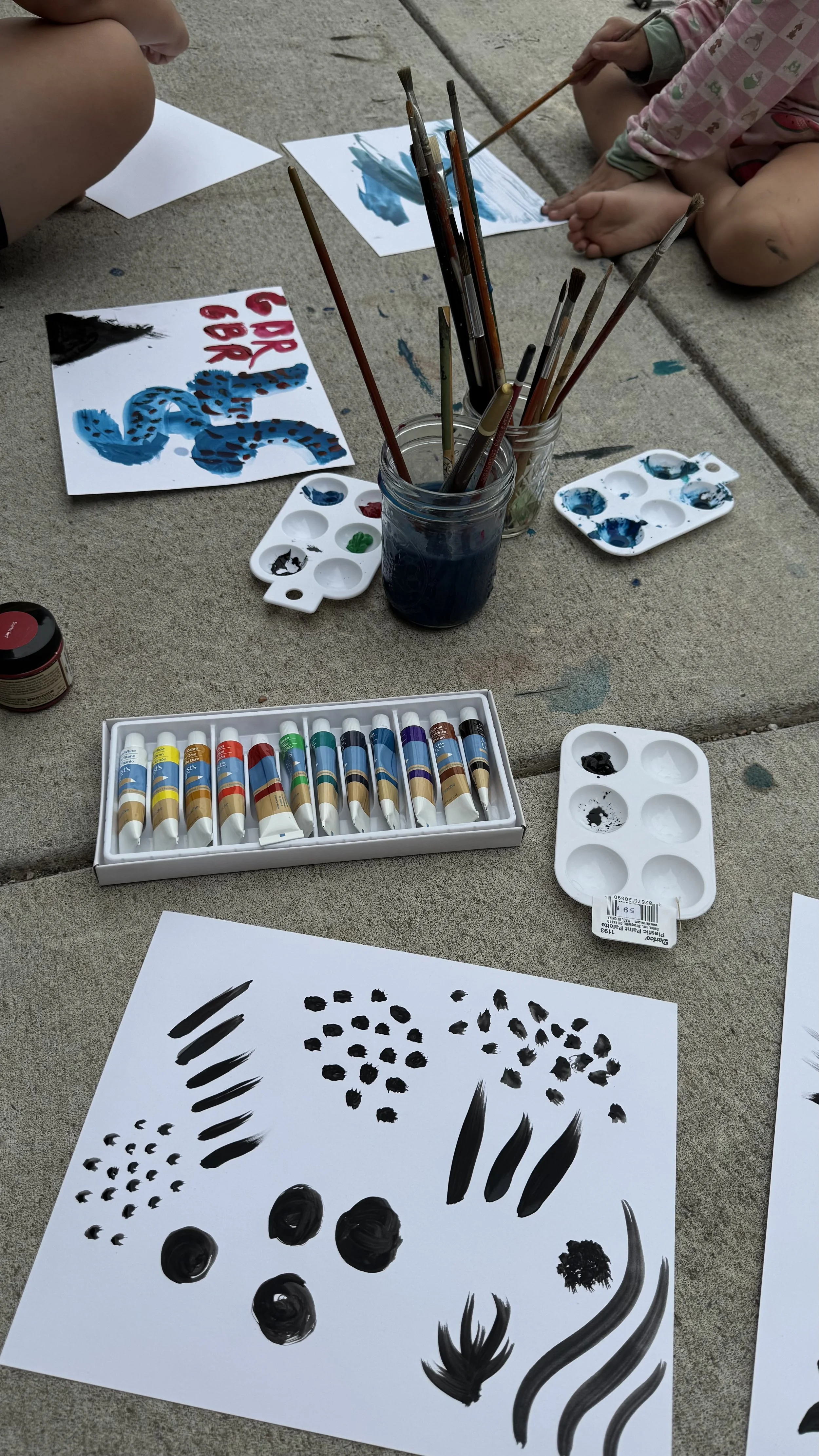
The Leaf Background Pattern
Throughout the conference you may notice I used a leaf pattern in a lot of the branding. The shapes in the pattern came from a day of painting outside with my two older kids. I scanned my painted marks into my computer before using Adobe Illustrator to arrange various leaf shapes to form this pattern. I love how it adds texture to all the designs without taking away from the main stars.
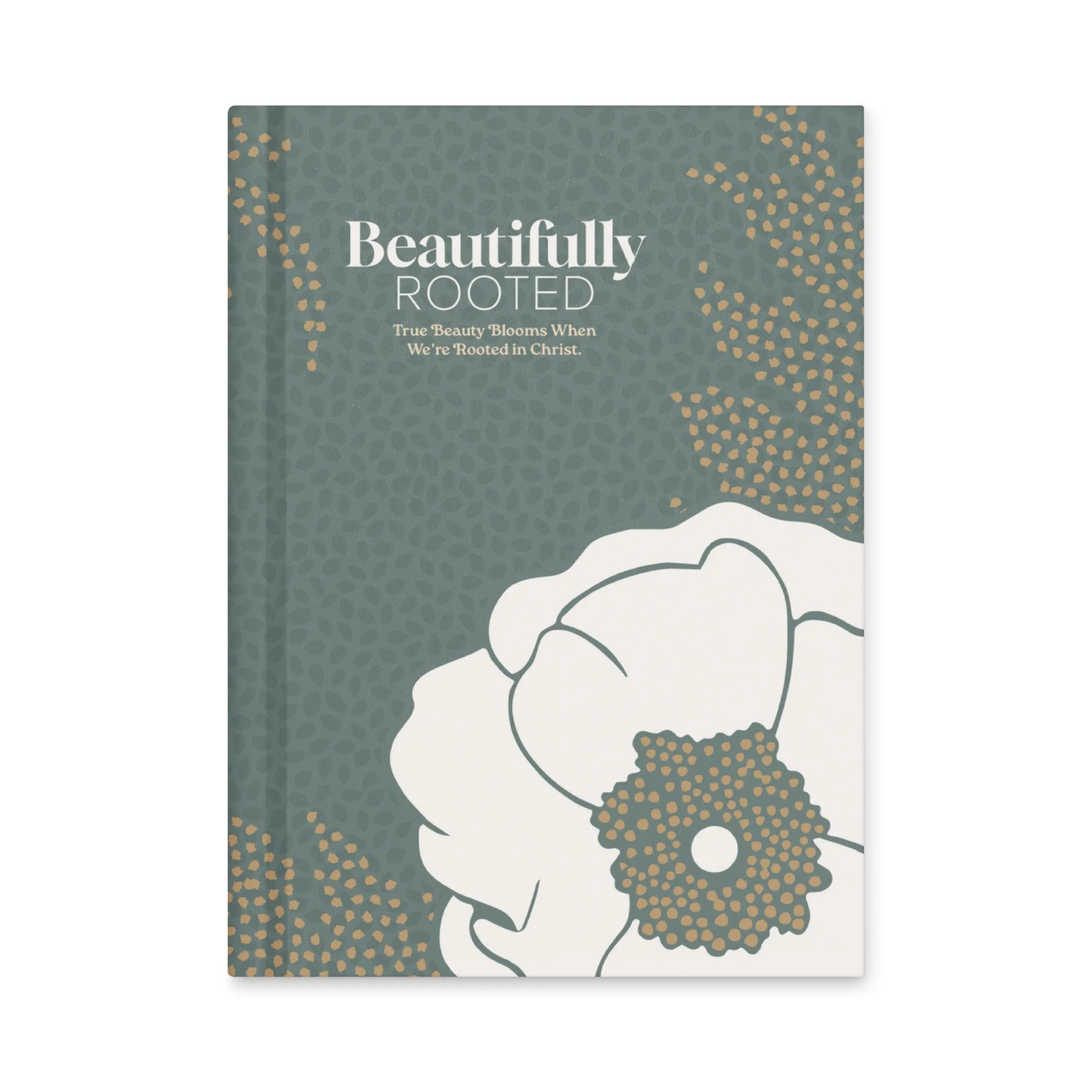
Grab your very own Beautifully Rooted Journal!
True Beauty Blooms When We’re Rooted in Christ!
This journal can help you track how you see God transforming your heart and making you more like Christ. Imagine reading through your journal and remember where God has worked and praising Him again and again. To God be the glory!
Smooth, stylish, and totally you—this matte hardcover journal is ready for your daily thoughts, sketches, or wild plans. 150 lined pages, tearable sheets, and a bold cover that pops.
• Matte laminated front and back cover
• 150 pages (75 sheets): lined, cream-colored, uncoated
• Cover weight: 80 lb (118 g/m²)
• Page weight: 70 lb (104 g/m²)
• Dimensions: 5.75″ × 8″ (14.6 cm × 20.3 cm)
• Perforated pages for easy tear-out
• Casewrap binding with a flexible sewn spine
• Blank product sourced and fulfilled in the US